Unknown2007-04-04 19:34:41
Well, I'm not much of an artist, but I wanted to get a visual picture of what I wanted in a character before I started 'em ( he's an Ur'guard). Now, begin the constructive critism.
Otherwise known as disembowelment.

Otherwise known as disembowelment.

Unknown2007-04-04 19:39:15
Not that I'm any good, but I can still point out what you did incorrectly. :)
- The shape of the face isn't terrible, but the eyes definitely aren't human (I'm assuming you drew a human). They eyes and ears also look to be a little too high, but I could be wrong. His nose and mouth could use some more detail. Same with the hands.
- The hair is very, very chunky. Kind of frightening.
- The muscles are horribly wrong. You might want to try looking at some anatomy references, they helped me quite a bit. The figure does, however, give a pretty good sense of depth to the pose...if that makes sense.
- The decapitated man in the background looks to e standing up...I really hope he isn't. If his head has fallen to the ground, chances are his body would've by then, too.
- I'm not positive, but there would probably be a lot more blood on the sword if it just cut through a guy's neck.
So, yeah, I've made the picture seem terrible. It's a good start, though, keep trying!
Kharaen2007-04-04 19:44:16
Don't let evil anime steal your soul >.>
Make your limbs more flexible.
Take a look at this for proportions. You might find it useful.
I like the eyes, kind of freaky.
Make your limbs more flexible.
Take a look at this for proportions. You might find it useful.
I like the eyes, kind of freaky.
Unknown2007-04-04 20:02:20
QUOTE(Kromsh @ Apr 4 2007, 07:39 PM) 395518
So, yeah, I've made the picture seem terrible. It's a good start, though, keep trying!
Thanks
Seriously though, thanks. If I'm going to learn, I need to know what I'm doing wrong (I'm pretty sure even Da Vinci didn't just decide to be the awesome). I also salute Kharaen for taking the time to send me the proportions site, thanks
Kharaen2007-04-04 21:01:29
Blame Leonardo...he's the one who invented the heads proportion thingy, I believe. Let's see here...
Also, head count helps determine how to differentiate age, determine heroes and monsters....For example a two-head character would be a baby, or a cute animal, a three heads character is a toddler, while comic books make their heroes 8-10 heads high. Normal people are 6-7 1/2 heads, with 6 being more adolescent/teenager and 7 1/2 full grown adult. 6ish can also be an elderly person.
2 Heads:
3 Heads:
4-5 Heads:
5 Heads:
8-10 Heads: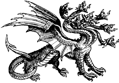
This is a Ben Caldwell book. He's got an animish look that I think you're trying to get, and his books are very good at teaching, since they were originally meant for children (you'll actually find these books not in the arts and crafts section in libraries, but in the children's section.) His books are also very very cheap. An excellent bargain.
Also, head count helps determine how to differentiate age, determine heroes and monsters....For example a two-head character would be a baby, or a cute animal, a three heads character is a toddler, while comic books make their heroes 8-10 heads high. Normal people are 6-7 1/2 heads, with 6 being more adolescent/teenager and 7 1/2 full grown adult. 6ish can also be an elderly person.
2 Heads:
3 Heads:

4-5 Heads:

5 Heads:

8-10 Heads:

This is a Ben Caldwell book. He's got an animish look that I think you're trying to get, and his books are very good at teaching, since they were originally meant for children (you'll actually find these books not in the arts and crafts section in libraries, but in the children's section.) His books are also very very cheap. An excellent bargain.
Kharaen2007-04-06 03:18:44
Tch, no one got the joke about the last picture?
Vix2007-04-06 03:24:13
The fact that's it's only 7 heads? 
Kharaen2007-04-06 03:26:41
Close  7-headed creature for an 8-head proportion! Too bad the hydra isn't 8 headed or it would have been really ironic
Unknown2007-04-06 05:09:12
OK, I tried to make a more realistic picture...
but I got this instead.

I know, he looks like he's cold. But after about 4 hours of working on it, I just said ah hell, OFF WITH YE!
but I got this instead.

I know, he looks like he's cold. But after about 4 hours of working on it, I just said ah hell, OFF WITH YE!
Unknown2007-04-06 05:25:29
QUOTE(Vix @ Apr 6 2007, 03:24 AM) 395899
The fact that's it's only 7 heads? 
You just don't see the other head it has actually....
Unknown2007-04-06 10:54:50
A two-headed post! Rawr!
Unknown2007-04-06 10:56:23
QUOTE(Kharaen d @ Apr 6 2007, 11:26 AM) 395902
Close  7-headed creature for an 8-head proportion! Too bad the hydra isn't 8 headed or it would have been really ironic
If it's a male, it'll have one more head. :ducks:
Kharaen2007-04-06 13:22:06
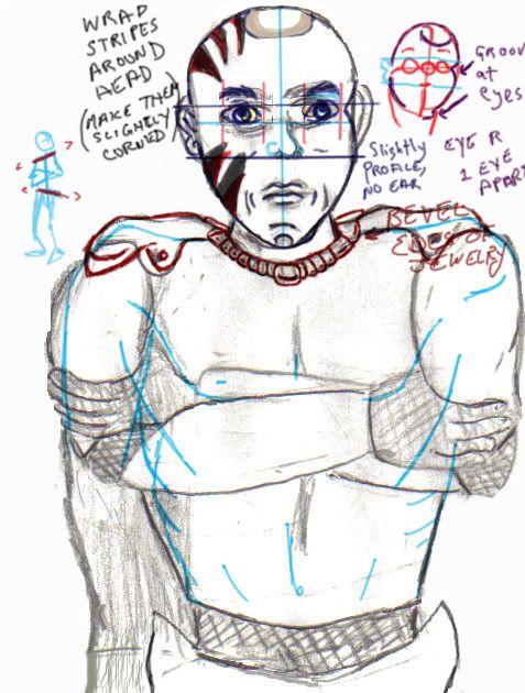
Okay, I tried to draw some instructions and quick fixes, working mostly on the face.
* It looks like you draw straight away when you draw, with no construction lines. I suggest that you first start with an oval for the head, then divide it into four quarters. If you really want to be advanced about it, draw a sphere, with the lines wrapping around the sphere, all the way around, so it's like two circles wrapping around the sphere.
* The eyes go over the equator line, and are spaced one eye apart. You draw the fake eye right in the middle of the face over the equator line, then your draw the other eyes at the edges of the fake eye. You can then erase the fake eye, and you've got eyes that should be appropriately spaced appart. This really only applies when the character is looking head-on, adjust as needed for profile views.
* You got no problems with the nose, thumbs up!
* Make a line across the face from the top of the eyes to the bottom of the nose. These are your ear lines. You place yours ears along the side of the head (not the back or front, try to keep perspective in mind!) in between those lines.
* Curves add appeal (this is why women are more attractive then men!)! Round out your lines to make them more pleasing, making the character become more appealing. Watch 'Lilo and Stitch'! Everything in that movie is done in curves, and it is likely one of the best animated films Disney has made.
* Your character is very rigid, and that's because his line of action is a straight line. It's hard to break that habit, but try to draw a skeleton before drawing your actual character, where the line of action (spine) has a slight curve to it. Old/fat people will have their curves be more pronounced because of the stoop of old age, or the weight of extra flesh.
* Remember the rule of heads...those arms are really deformed. Foreshortening is difficult, but luckily, you don't need to apply it to this drawing since it is a head on drawing!
EXTRA TIPS:
- Old people have much more wobbly parts, so make their nose and ears bigger then you would for a normal sized adult.
- Kids, on the other hand, have much smaller ears (like round circles instead of elongated ovals) and their eyes take up half their face!
- Draw a skeleton of your character before you draw it, and don't be satisfied until it is drawn. Ideal skeletons will have an action line that isn't straight.

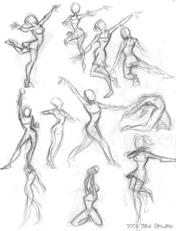
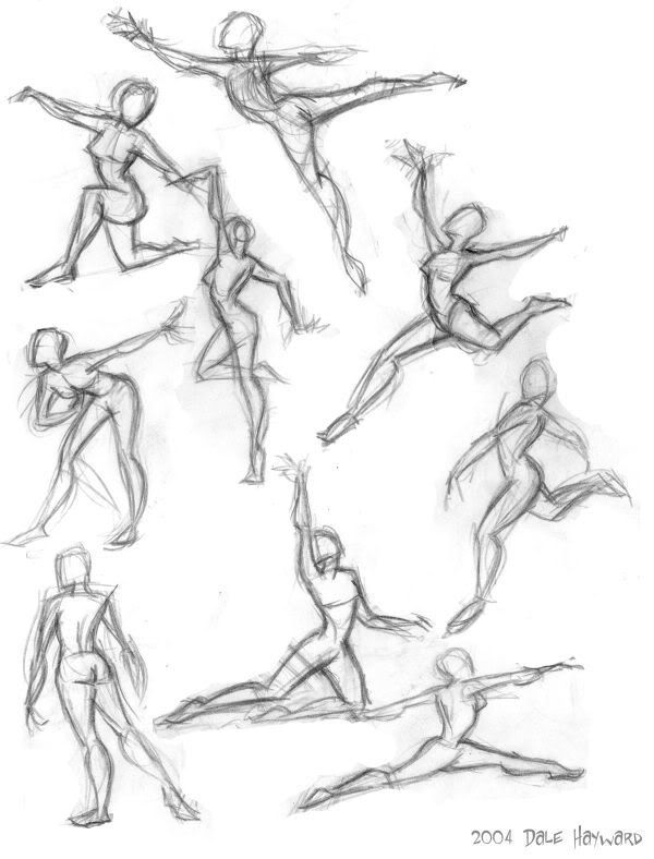
- Try to draw your characters in shapes, and alter the shapes as necessary.
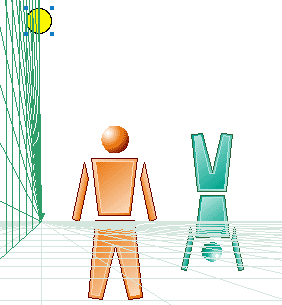
- Draw a simple floor grid to keep your character in perspective!
- Study animation/anime that you admire and try to pick out the traits of their characters, and apply that knowledge to your own drawings.
- Dynamic drawings tend to be on a 3/4 profile. The more head-on the drawing, the less dynamic it is, so try to make your character at least a little in profile to make it more dynamic.
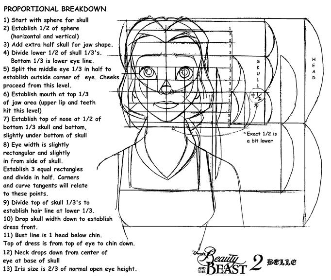
- Here's Bell's head done in detail, should help you out!
- Example of awesome foreshortening:
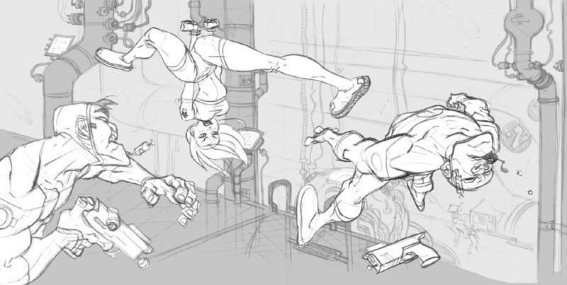
- If you want to study foreshortening, I suggest watching The Matrix animation shorts, or the early Aeon Flux cartoons aired by MTV.
Hoped this helped a bit.
Daganev2007-04-06 18:37:43
small piece of advice about the arms.
The biceps are "too short" and thats why the arms look funny. The main reason for this common mistake, I find (at least in myself) is that I tend to forget that the arm is not just made of the bicep, tricep, elbow, and forarm. There is space between those main muscle groups as well.
Also remember that the tricep is much longer than the bicep and all those propotions issues there.
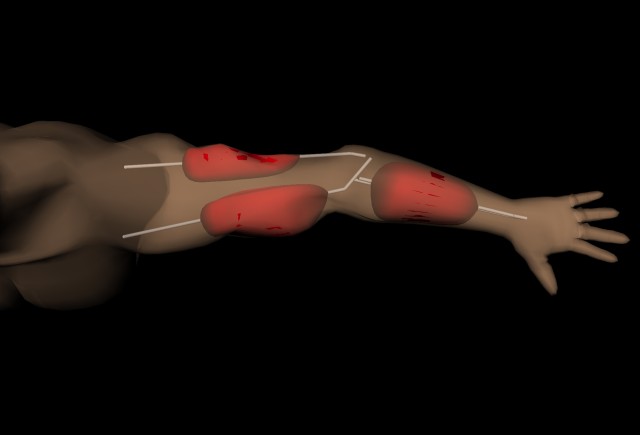
Lastly, you don't have shading. Good shading can make bad proportions look good.
The biceps are "too short" and thats why the arms look funny. The main reason for this common mistake, I find (at least in myself) is that I tend to forget that the arm is not just made of the bicep, tricep, elbow, and forarm. There is space between those main muscle groups as well.
Also remember that the tricep is much longer than the bicep and all those propotions issues there.

Lastly, you don't have shading. Good shading can make bad proportions look good.
Kharaen2007-04-06 18:41:38
Actually, I wouldn't suggest shading until you've come along much further in your drawings. My animation teacher (when I was going to school) said that shading is unnecessary and the mark of an untrained artist. Line drawings can be quite beautiful, and they are called line drawings because of their crisp, clean look and lack of shading. Keep shading for when you'll actually colour the image.
Daganev2007-04-06 18:54:56
QUOTE(Kharaen d @ Apr 6 2007, 11:41 AM) 396013
Actually, I wouldn't suggest shading until you've come along much further in your drawings. My animation teacher (when I was going to school) said that shading is unnecessary and the mark of an untrained artist. Line drawings can be quite beautiful, and they are called line drawings because of their crisp, clean look and lack of shading. Keep shading for when you'll actually colour the image.
Heh, maybe thats why I suck so much. I was taught shading first and line drawing later in life, but I can't draw line drawings very well.
But I find drawing with shadows is much cooler than drawing with lines.
Kharaen2007-04-06 19:20:30
QUOTE(daganev @ Apr 6 2007, 02:54 PM) 396020
Heh, maybe thats why I suck so much. I was taught shading first and line drawing later in life, but I can't draw line drawings very well.
But I find drawing with shadows is much cooler than drawing with lines.
But I find drawing with shadows is much cooler than drawing with lines.
Most people who just draw for fun do
Shading's fine, you just need to establish your lines first. Shading in colour is even better. Or solid shadows (cross hatching is fine if it's an ink drawing.)
Verithrax2007-04-06 20:09:42
You need to pick your media. If you're going to colour, shade with coloured pencils, or cross-hatch with coloured felt-tips or whatever. If you're going for black and white, shading is done with your pencils or pens.
However, shading in colour needs a bit of correction to make shaded areas darker, and it's important to note that regions of shadow and penumbra are less saturated than those in the light (That is, colours tend to lose their hue.)
But shading is important; unless you're drawing a cartoon, the plain line drawing doesn't convey shape, detail or texture very well. Photorealistic drawings are nothing but shading (Even though they start their lives as line drawings.) the reason is that in real vision, objects don't have marked, rigid outlines. Shading helps give texture and delineate shape; some objects (Notably pottery, wine glasses and such) become very flat and unappealing if done with "pure" line art. The human anatomy is mostly rounded and gradual, so shading is important unless you're going for a cartoon-like style; even comics generally have varying degrees of shading (Frank Miller's Sin City, notably, is drawn in sharp contrasts of light and shadow, to the point where there is nothing but the rigid cel shading and many of the lines delineating objects and characters are lost).
Then again, I'm not terribly good with a pencil, so what the hell do I know?
Kharaen2007-04-06 21:15:16
QUOTE(Verithrax @ Apr 6 2007, 04:09 PM) 396040
You need to pick your media. If you're going to colour, shade with coloured pencils, or cross-hatch with coloured felt-tips or whatever. If you're going for black and white, shading is done with your pencils or pens.
However, shading in colour needs a bit of correction to make shaded areas darker, and it's important to note that regions of shadow and penumbra are less saturated than those in the light (That is, colours tend to lose their hue.)
But shading is important; unless you're drawing a cartoon, the plain line drawing doesn't convey shape, detail or texture very well. Photorealistic drawings are nothing but shading (Even though they start their lives as line drawings.) the reason is that in real vision, objects don't have marked, rigid outlines. Shading helps give texture and delineate shape; some objects (Notably pottery, wine glasses and such) become very flat and unappealing if done with "pure" line art. The human anatomy is mostly rounded and gradual, so shading is important unless you're going for a cartoon-like style; even comics generally have varying degrees of shading (Frank Miller's Sin City, notably, is drawn in sharp contrasts of light and shadow, to the point where there is nothing but the rigid cel shading and many of the lines delineating objects and characters are lost).
Then again, I'm not terribly good with a pencil, so what the hell do I know?
However, shading in colour needs a bit of correction to make shaded areas darker, and it's important to note that regions of shadow and penumbra are less saturated than those in the light (That is, colours tend to lose their hue.)
But shading is important; unless you're drawing a cartoon, the plain line drawing doesn't convey shape, detail or texture very well. Photorealistic drawings are nothing but shading (Even though they start their lives as line drawings.) the reason is that in real vision, objects don't have marked, rigid outlines. Shading helps give texture and delineate shape; some objects (Notably pottery, wine glasses and such) become very flat and unappealing if done with "pure" line art. The human anatomy is mostly rounded and gradual, so shading is important unless you're going for a cartoon-like style; even comics generally have varying degrees of shading (Frank Miller's Sin City, notably, is drawn in sharp contrasts of light and shadow, to the point where there is nothing but the rigid cel shading and many of the lines delineating objects and characters are lost).
Then again, I'm not terribly good with a pencil, so what the hell do I know?
I imagine you are correct. I can't pull up your drawing, but what you say makes sense.
But shouldn't you learn the basics before you get into the detail? Like you said, life starts as a line drawing for a photorealistic drawing, so shouldn't the line be mastered before moving on to shade and shadows?
Verithrax2007-04-06 21:56:17
QUOTE(Kharaen d @ Apr 6 2007, 06:15 PM) 396047
I imagine you are correct. I can't pull up your drawing, but what you say makes sense.
But shouldn't you learn the basics before you get into the detail? Like you said, life starts as a line drawing for a photorealistic drawing, so shouldn't the line be mastered before moving on to shade and shadows?
But shouldn't you learn the basics before you get into the detail? Like you said, life starts as a line drawing for a photorealistic drawing, so shouldn't the line be mastered before moving on to shade and shadows?
I's two ends approaching the same place. Drafting classes, animation, comics, and so on teach line art first, but starting from shaded drawings of inanimate object (Often still lifes) and moving on to more complex things (Often working one's way up through anatomy) is another approach (The one taken more often in fine arts courses). Shading isn't detail; a lot of artists turn it into detail, but it doesn't have to be; it can be a main constructive element; a lot of artists use lines as scaffolding and make them disappear entirely in the finished work.
I do admit that a good understanding of structure, proportion, and form is fundamental (Because you need to build your subject out of lines), but picking between lines and shading for conveying the final image is a matter of personal preference.
